PANTONE 13-1023 Peach Fuzz captures our desire to nurture ourselves and others. It’s a velvety gentle peach tone whose all-embracing spirit enriches mind, body, and soul. In seeking a hue that echoes our innate yearning for closeness and connection, we chose a color radiant with warmth and modern elegance. A shade that resonates with compassion, […]
THE WORLDWIDE STANDARD GUIDE FOR CHOOSING AND MATCHING COLORS This versatile, end-to-end color matching tool displays 2,390 market-driven spot colors in the Pantone Graphics System on coated and uncoated paper stocks. Now updated with 224 brand new Pantone Matching System (PMS) colors, featuring five new eco-friendly Pantone
What is Viva Magenta? Pantone’s Color of the Year, Viva Magenta 18-1750, vibrates with vim and vigor. It is a shade rooted in nature descending from the red family and expressive of a new signal of strength. Viva Magenta is brave and fearless, and a pulsating color whose exuberance promotes a joyous and optimistic celebration, […]
ANNOUNCING THE PANTONE COLOR OF THE YEAR 2022 Displaying a carefree confidence and a daring curiosity that animates our creative spirit, inquisitive and intriguing PANTONE 17-3938 Very Peri helps us to embrace this altered landscape of possibilities, opening us up to a new vision as we rewrite our lives. Rekindling gratitude for some of the […]
PANTONE 17-5104 Ultimate Gray + PANTONE 13-0647 Illuminating, two independent colors that highlight how different elements come together to support one another, best express the mood for Pantone Color of the Year 2021. Practical and rock solid but at the same time warming and optimistic, the union of PANTONE 17-5104 Ultimate Gray + PANTONE 13-0647 […]
315 essential new choices from the only color authority that matters! • Presented in a fresh color arrangement that streamlines digital and physical workflows so you can meet all your daily design requirements. • Presented in an updated color arrangement that streamlines digital and physical workflows so your projects will strike a chord with the […]
ANNOUNCING THE PANTONE COLOR OF THE YEAR 2019 PANTONE 16-1546 Living Coral An animating and life-affirming coral hue with a golden undertone that energizes and enlivens with a softer edge Vibrant, yet mellow PANTONE 16-1546 Living Coral embraces us with warmth and nourishment to provide comfort and buoyancy in our continually shifting environment. In reaction […]
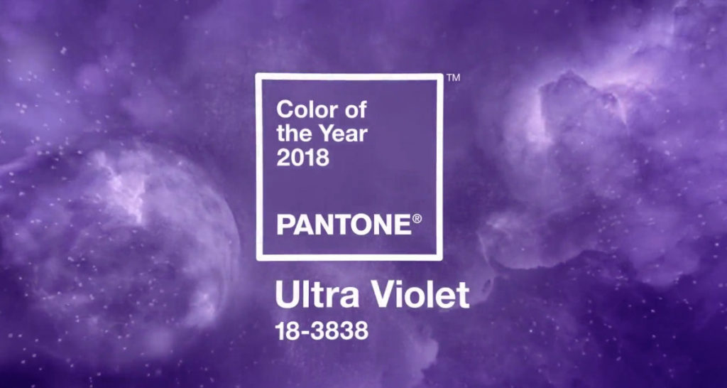
Inventive and imaginative, Ultra Violet lights the way to what is yet to come. ANNOUNCING PANTONE 18-3838 ULTRA VIOLET, PANTONE® COLOUR OF THE YEAR 2018. A dramatically provocative and thoughtful purple shade, PANTONE 18-3838 Ultra Violet communicates originality, ingenuity, and visionary thinking that points us toward the future. Complex and contemplative, Ultra Violet suggests the mysteries […]
Your guides may be more than 13 years old. Upgrade to the latest guides and books today for the most accurate and complete colour selection. Find your current product and to see if you are missing out on more colours…and more opportunities.
- 1
- 2


